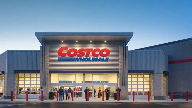
Understanding the lighting environment in which a package will be displayed at retail is critical to the sales.
Perception of color and recognizing messaging details change considerably in different lighting conditions. If you ever want to prove this, look at a package in your house or office and then take it outside preferably in the morning/late afternoon. We bet the color changes considerably.
Let’s take a deeper look at Costco lighting, how it’s defined and how this lighting condition impacts our decisions on packaging design and printing.

Six things to keep in mind based on the Costco lighting conditions:
Location
Knowing the Costco floor plan is essential and often forgotten. Is your product going into the steel (racking)? If so, things are a lot darker than items in electronics, health and beauty or food. Pale yellows and dark designs don’t do well under the steel. You need open trays to let as much light shine on your product as possible
Color Blocking
A dominating single background color is most effective. Bright, bold colors don’t have as much to do with recognizably as you may think. So, stay with colors which are right for your brand.
Transitioning the color across the primary packaging and trays helps enhance this effect. Brands in the photos below have done a fantastic job at this. Ensuring your primary and secondary packaging structure allows for these large surfaces, will support the graphics.
Strong color blocking/visually arresting patterns stand out on shelf
Large logos / product images
Costco warehouses are not an intimate experience. Competing with the large space of a Costco warehouse with every other brand vying for customer attention requires large logos and product images to stand out. Overlaying large logos (if brand is well known) or product images onto a color block background, will make the package stand out.
Simple, uncomplicated
Clear value proposition
In exchange for their annual membership cost, Costco members expect to get products for higher value. Communicating value is critical and ideally is done with no or few words.
The size of a package (take Doritos for example) is often enough. Clearly showing the quantity of products in each package is another method. Stay away from long explanations.
Costco doesn’t stock a a large amount of the same product types in most cases so customers aren’t comparison shopping as they may do at a grocery store or other big box retailers.
Embrace the Treasure Hunt experience
Color and Value Statements go hand and hand. Bold color with large, simple, san-serf type explicitly showcasing what you are selling key. Embrace the “reverse out” type. Look below and what do you see? 2x as Effective and Twin pack for starters..


Understanding how to get your product recognized by knowing the Costco lighting conditions gives any brand a significant advantage.
The environment is different than other retail but, that’s what makes it so special and why we love to design winning packaging for Costco.
Reach out to us with any questions or advice.
